5 Website Mistakes Real Estate Agents Make (And How to Fix Them)
Discover the most common website mistakes real estate agents make and how to fix them to improve conversions, build trust, and generate more high-quality leads.
REAL ESTATE MARKETING
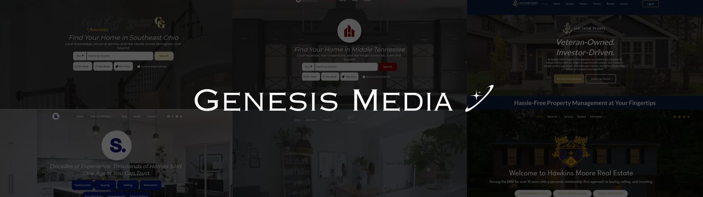

5 Website Mistakes That Cost Real Estate Agents Thousands (And How to Fix Them)
Your website should be your #1 online sales tool — but for most real estate agents, it’s the biggest reason they’re losing leads without realizing it.
Here are the most expensive website mistakes agents make (and how to fix each one).
1. No Clear Value Proposition
Most agent websites say the same thing:
“Your trusted real estate professional.”
“Committed to excellent service.”
“Helping you buy or sell in [City].”
None of these tell the visitor why they should choose you.
How to fix it:
Put one clear statement at the top of your homepage that explains:
Who you help
Where you help
What makes you different
Example:
Helping homeowners in Centreville & Northern Virginia sell faster and for more through strategic marketing.
2. No Proof or Social Validation
You can’t expect someone to trust you with a six-figure transaction if your website doesn’t show:
Testimonials
Recent sales
Client success stories
Before/after results
Case studies
How to fix it:
Dedicate a homepage section specifically for proof.
No proof = no trust.
3. Slow Load Speed (This Kills Conversions)
If your website takes more than 3 seconds to load, you’re losing over half your traffic.
Slow load speed happens from:
Heavy images
Poor hosting
Bad page builders
Unoptimized code
How to fix it:
Compress images, switch to fast hosting, and simplify your website’s structure.
Speed = rankings + conversions.
4. No Clear Call-to-Action
If your site doesn’t tell visitors exactly what to do, they won’t do anything.
Most agent websites fail because there is:
No booking button
No home valuation form
No lead magnet
No schedule link
How to fix it:
Use one primary CTA throughout the page:
Book a Consultation or Get Your Home Valuation.
5. Too Many Options, Not Enough Direction
When a homepage has:
8 sections
12 buttons
Three different menus
A cluttered layout
…people get overwhelmed and leave.
How to fix it:
Simplify.
Guide visitors down one clear path — not five.
Final Thoughts — Your Website Should Sell for You
A real estate website shouldn’t be a digital business card.
It should:
Build trust
Show proof
Communicate your value
Capture leads
Get people to book a call
When it’s built correctly, it becomes your most valuable online asset — and it works for you 24/7.
If you want a website audit that shows exactly what’s hurting your leads, book a free audit with Genesis Media and I’ll break it all down for you.
